Showing posts with label Research. Show all posts

Monday, 13 March 2017

Sound Editing

I've finally downloaded Audacity on to my computer and I am now currently editing the sound levels and trying to fix the wind problems.

My short film's audio.


First of all I just listened to the audio of the short film, without any footage. It's quite interesting and actually makes it easier to notice where the audio jumps a bit, where normally I would be distracted by the footage. Just listening makes it very good for identifying what sounds well and what doesn't.

So to try remove the wind sound what I do is I select a scene where the sound is fine. I then set this as the sound profile. I then highlight the scene with excessive wind, and then I click ok. This then filters the wind sound out of the scene.


It did not work as I planned, I will be honest. Without the footage, I find it hard to tell how good it is. But I do think that is an improvement. I have several saved different audio files and compare them to the footage I have at school. The files are nicely organised, as seen below.


Reflective Comment:
I sort of always knew that I would never be able to completely get rid of my sound issue. However I feel that Audacity has helped a little bit, and it I do think it sounds better than it did before. It adds a strange whistle sound to the audio, however I feel this may fit the film.


Wednesday, 1 March 2017

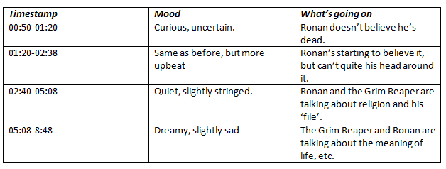
Music timings table

I have created a table for timings for music for my short film. In this table there is a time-stamp, the mood of said scene and also the actual content of the scene. This is going to be sent to Greg so he can create some music for the short film. Greg has created some test music which has helped us both in deciding what would fit best.


Reflective Comment:
This time-stamp table is going to be very helpful for creating music for my short film. Spilting it all up makes it very easy to make sure that each scene is given the correct music.

Sunday, 26 February 2017

Survey Feedback

So a few weeks ago I created a detailed survey about my poster and my draft. You can find the post about that here. I have now got the results.

Are you male or female?
How old are you?

Are you religious?

Do you like the design poster?

Do you think the poster would catch your eye?

Did you like the short film?

Do you think the poster works well with the short film?


So from my feedback it seems that what I am doing I am doing right. I can make a few changes to what I have. I'm hoping to do some interviews with some more particular audience members and get some more in depth feedback. There were 'Why?' question in the survey but they were quite basic in their responses.

Reflective Comment:
While the feedback I have received isn't too in depth, I still find it useful. Using this information I can adapt my next draft for both the film and poster to better please my audience.

Wednesday, 22 February 2017

Class Feedback on Poster

I decided to show my poster to my class to receive some feedback. The poster I showed was my sixth draft. I had a few questions on the board to indicate what I was trying to gain from my feedback. I have attached a Vimeo video below of the feedback. With the feedback, I made a few slight changes.


Below is the improved poster with the feedback I received.


The changes that I have made to the poster are only slight but I do think they improve the overall quality of the poster. First I removed the WordUp logo from bottom left corner as it filled too much space and didn't really fit in with the atmosphere on the photo. I also made the block credit bigger and easier to read. The other change I made was the addition of a scythe for the Reaper, making it much clearer who he is and what the film is about.

Reflective Comment:
I'm happy with the changes I have made and feel like with a few small tweaks I'll have a finished poster. I'm planning on showing my poster infront of my entire year in assembly, as they won't know what the film is about like my class do. Their view will be unbiased and much more truthful.

Monday, 6 February 2017

Analysis of Poster Development

Below I have attached a voice thread in which I go through all my different drafts for my posters. I highlight my ideas, whats changed and feedback I have been given. This voicethread is quite useful in observing how my ideas had progressed, and is quite useful when looking back in reflection.


I apologise for the audio quality.

Reflective Comment:
Completing this was actually quite useful in understanding how my ideas have developed. I can clearly see now how my ideas have grown over the past few months and I think this voice thread will be very useful in helping others understand how my ideas have grown. 

Thursday, 2 February 2017

Planning for filming on the 5th


Above I have attached a slide about my filming plans for this Sunday. I am planning to print this off and taking it on the day to hopefully make the filming process a lot more smoother. I had wish I had done this sooner really.

Reflective Comment:
I feel like that with this small plan that filming will go a lot smoother than it has previously. Also now that I've worked with Ronan and Peter a few times I feel confident working with them. 

Wednesday, 1 February 2017

Magazine article contents 2nd attempt!

So after my first attempt at writing a film review for my ancillary task, I now am going to attempt to write a second attempt. This time I have a better understanding of the mode of address that IndieWire uses so I can better replicate the way they write.

Article

"I don't really know." The following line is said quite a few times during the short film about the Grim Reaper and his unfortunate friend. While many would expect the Grim Reaper to know everything and anything about life and death, but Dying Denial offers a much more humorous and clueless Grim Reaper.

Dying Denial leads with only two characters, however they are extremely strong characters. Nathan, who has recently died, is perplexed about his current predicament and just can't stop asking heavy loaded questions. Asking about religion and the meaning of life, Dying Denial explores several different subjects, but does not offer a definite answer to anything. The film is very open ended and definitely up for discussion.

A highlight of the film is certainly Peter Long's portrayal of the Grim Reaper. Serene, wise and amusing, Peter excels in the role. Acting as a guide for Nathan, and in part the audience, you'd hope that the Grim Reaper is quite alike to how Peter portrays him. His chemistry with Ronan is strong, as Ronan plays the poor guy who has unfortunately died. Ronan plays his role exceedingly well and convincingly.

When you break the film down, all it is is one man's passing on. It doesn't focus on dramatic goodbyes or second chances. Death comes, and there is nothing you can do about it when it does. It's a sombre ending, but as an overall film, it's quite a touching take on dying. The film is open-ended and open to interpretation, so much to the point where anyone could enjoy it.

Reflective Comment:
I'm still not overly happy with the article contents. I feel I am struggling to do it correctly . I have analysed IndieWire so hopefully this second attempt will be closer to the mark. 

Tuesday, 31 January 2017

Emaze on props

I have created an Emaze on implementing props into my short film.


Reflective Comment:
I am looking forward to adding props to my film. I think it will add more content to the film and add more depth to it. It'll also allow me to add more meaning to my film. 


Monday, 30 January 2017

Audience feedback survey

I have completed and have just sent out my survey. My survey focuses on both the poster and the short film. Anyone doing the survey looks at the poster first, saying what they like and do not like and what they can infer. Then they watch the short film, and give me feedback on that. Then, they look at the poster again after watching the film and understanding the plot.

I'm putting my survey on Twitter, Facebook and Reddit. I'm hoping to get a lot of responses that are honest. When you show someone in person they're always too nervous to say anything negative, so once they can analyse it without me over their shoulder they're bound to be more honest about it.

Here are some screenshots of my survey.


Reflective Comment:
I am hoping to get real feedback which is critical and helpful. Hopefully with the feedback I receive I can better improve my short film in it's third draft, and the poster if need be. 

Thursday, 19 January 2017

Analysing IndieWire

So I've started analysing the reviews from IndieWire. I'm trying to identify what common similarities all the reviews share. From the mode of address to how they actually review the film.

Content
The reviews often start with either a key quote from the film or by identifying the key characters and their motivations. The reviews then often break down the basic narrative of the film without giving away too much of the plot, only highlighting key scenes. The reviews then end with a grading, ranging from A-F. A being very very good, F being terrible.

Mode of Address
I found a really useful article that talks about the Modes of Address. It can be found here.
The article is written with an indirect mode of address, and is quite optimistic and slightly humours. The article also make mention of the fans of other films, and how they may be interested in whatever film they're writing about.

The Review
When it comes to writing the review itself I've found a useful article on how to structure a film review, that fits with IndieWire. It can be found here. IndieWire reviews often focus on the characters and the writing the most. In many reviews music and cinematography do not seem to be focused on.

Language
IndieWire article writers tend to use quite smart sounding words when writing their articles. Some sentences are written in such a way that they sound like something from a creative writing piece. When I write my review I'll have to make sure to replicate this way of writing.

Examples:

  • "Indeed, “We Are the Flesh” is so instructive that it’s hard to find any wiggle room for even the most amenable viewers to think for themselves."
  • "Some passages manage to provide both, as protracted close-ups of the actors’ genitals are sustained for long enough to go from amusingly confrontational to intellectually bankrupt."
  • "Mexico may be eating itself alive, but there’s only so much that can be gleaned from watching it chew with its mouth open."

Reflective Comment:
I'm quite glad I've done a analysis of IndieWire, as there seems to be a lot more how to you write an article than I originally realised. What I wrote a few weeks ago is not suitable for IndieWire and I now know that I have to write it again in a more suitable fashion. 

Monday, 16 January 2017

Magazine article analysis: IndieWire

I have decided that IndieWire is the website that I think I will be writing my review for. IndieWire is a long standing independent magazine about film, tv and radio. They review both big films and independent breakthrough films. My film is perfect for this website.


I went over to the reviews page of the website and took some screenshots to some links that lead to reviews of independent films.


I then quickly edited one of these article openers and replaced it with a picture from my short film and changed the text. It fits in with the rest of the reviews and I think shows that my film fits well on the site. 


Reflective Comment:
Knowing what website I'm going to put my review on is very helpful with moving forward with my ancillary task, as I can begin to identify what mode of address they use and how they format their articles.

Friday, 13 January 2017

First Draft audience feedback

Today I faced my nerves and showed off my first draft to members of my class. I showed around six students my first draft. I created a temple in which I could take note of what people liked, disliked, what their favorite part was, and how I could improve.

What is good
Most of my watchers all found they liked similar things about the movie. The most common aspect of the film that everyone seemed to enjoy was the narrative and the character of Death, played superbly by Peter Long.

Also mentioned was the camera work, the light-hearted humour and the lighting in certain scenes.

What is bad 
I had one constant complaint from each viewer of my short film, which was about the sound quality of my film. During the scene on top of St.James Hill the audio is hard to understand and unpleasant to listen to due to the wind.

Favorite Parts
While everyone seemed to favor different things about the short film, they all came down to the atmosphere and characters. The character of Death, his personality and the general flow of the film. People seemed to really understand what I was going for and enjoyed it.

To Improve
What I need to do to improve is to iron out the issues that I'm currently having with the audio. My friend Greg has possibly suggested using Audacity, and if this does not work I should be able to do some re-shoots.

Reflective Comment:
I am overly relived that my first draft has been well received so far. I'm hoping to get the rest of the filming done and complete a second draft, to re-complete a similar process.

Thursday, 12 January 2017

Another Poster draft and comparison

I've finally managed to uncorrupt my first poster draft and now am able to upload the poster to my blog. I definitely need to work on the typography, but I quite like the simplicity of it.


Now that I have both poster drafts, I can conduct some audience research on which poster people actually prefer. I have a feeling that the end product will resemble something in between the two, but we will see. To remind you, this is the other poster.


Reflective Comment:
I'm glad that I have two drafts for two different posters, as it gives me a few options that I can explore going forward. I'm planning to have some form of audience feedback by this time next week.

Wednesday, 11 January 2017

Pixlr and drafts

I created a draft poster using screenshots from my film on photoshop, but for some reason the file became corrupted. As I do not have photoshop at home, I looked for other photo editors. What I ended up finding, was Pixlr.

                  Image result for Pixlr
Pixlr is a free photo editor. While not as complex as Photoshop, it offers the same basic features. Curious to what the program could do, I started messing around with the pencil. I realised that you could create some quite intersting typography with it.

That took about about a minute or two to make. I continued to mess around with the program and eventually made the following.


Looking a bit better now. The black cloud looks a bit rough but I think the typography looks good, reminds me of chalk writing. I then took a few minutes just creating a rough draft of a possible poster idea.


While not perfect in any way, I think that this is quite a good draft for another option for my poster. Originally the only other option I had was the film screenshotted one. Now I have two options. 

Once I recover my first poster draft, I can get other people to decide which one they think looks better. While I think I'd rather do my original idea, it'd be a good idea to do some audience research and get some feedback. Perhaps I could even somehow mix the two together.

Reflective Comment:
Considering I only found Pixlr about 45 minutes before making this post, I think my little tests are okay. They aren't overly great, but for rough drafts I think they'll do. I could always mix the typography of these tests with my pre-existing idea. However I think the best way forward is to do some audience research.

Wednesday, 28 December 2016

Poster Draft using Film Screenshot

So I have a very clear idea for what I want for my poster. I want it to be a scene from the film itself, which is useful because that means I can test it with the footage I already have. My plan is to take a portrait photo when I film the re-shoots, as the footage that I am going to test with is landscape, which is not what I want.

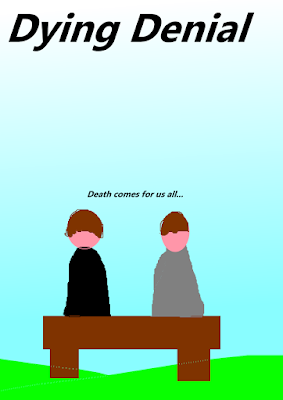
 So here we have my paint.net draft poster.


Here is a screenshot from my first draft.


Here is a rough edit.


Now I really want to make it clear, that this is a very rough draft. The only software I have at home is paint.net, which is not very good. However at sixth form we have Photoshop, so I can create a much better draft there. Once I have a good draft, I can experiment with a bit, get the portrait photo and create the final poster.

I know where the title and tagline are going to be placed, as seen in the draft. I'm not sure where the other information is going to go though. I have created another rough draft to show some potential ideas.


The main three other items I need on the poster are in red. I need my name, and my two actors name. I'm not sure what else to add, I quite like the simplicity of the poster like this. I was thinking that possibly the actors names could stretch across the bench diagonally.

Reflective Comment:
It's a very rough draft, but I'm getting closer to the final piece. One at school again, I'll have access to Photoshop and I'll be able to create a much better looking poster. I'm aiming to have the poster done by the end of January, which I think is a very sensible target.

Monday, 5 December 2016

Problems I faced while filming

While I did my filming I faced a few problems. It was a good, productive day. There were a few small problems that I had to deal with though, and some I didn't realise until we had stopped filming and I was editing. 

Sound

In the background of many of my shots you can hear a lot of interference. This I can deal with during editing, however there are some things that I can't work round so easy. In some shots there are motorbikes revving past and car horns being extremely loud. There isn't much I can do about this, except not using those scenes.

Weather and lighting

Something you have to fight when filming outside is the weather and the lighting. During one of my scenes it begins to rain, this itself wasn't a problem, however the problem was that some rain dropped on to the camera lenses. It was so faint, that I couldn't see it at the time. Now, on a big screen, you can faintly see it. I can't really do anything about this until I re-shoot it. 

Also, during two scenes the lighting is really strange. For some reason, the lighting goes an orange color. I haven't tried editing it yet, so we'll have to see if I can work around it.

Reflective Comment:
These are minor problems that I'm facing. I could have a lot worse problems, so I'm not to be bothered. I can work round these problems. 


Location Test Footage

On the 3rd of December I got some of my filming done. Before my actors arrived I decided to capture some test footage to get a look at the lighting, footage quality and sound. I have made a quick video in which I show the test footage and list what's good and bad about it. I have attached the video below.

I recommend enlarging the video. For some reason the upload to my blog has caused the quality to significantly drop. Hoping to fix that soon.


Reflective Comment:
The test footage I got was quite helpful, as it gave me a chance to prepare for the filming. I can see what needs to be improved and can start planning on what I'm going to do counter my problems.


Wednesday, 30 November 2016

Similar Posters

My good friend Jude sent me a link yesterday, which shows how off movie poster cliches. There is a whole section about posters that feature benches. Here is the link : http://voguesugar.com/movie-posters/

Here are all the posters that they say fit the cliche.


This image alone is really helpful in understanding the conventions of the typical bench poster. I can see the typical conventions, such as typography and fonts. When it comes to designing my poster, I feel that this will be very helpful.

Reflective Comment:
Pretty happy that I've found this page, as it's going to be very helpful when designing my poster. You can already see a clear trend with these posters, and I now can decide if it's going to be conventional or not. 

Thursday, 24 November 2016

Creative Typography (Part 1)

I've been starting to use tutorials online to help improve my photoshop skills for when I make my poster. I was really interested in layering photo into text, so that's what I learnt to do. Below is what I learnt how to do.

I'm pretty happy with what I learnt how to do. I done four examples. The water and fire examples were very simple and quite easy. I think it's a nice effect, especially the water one.

I wanted to try something that was recognizable. I decided to do The Walking Dead, as it's a very popular show and you can be quite imaginative with the typography. For the first one, I decided on a simple cover, with the show's recognizable zombies.

For the second Walking Dead one, I tried to be more unique. The recent season six finale was a crucial part of the story, and one of the most memorable from the comics. It ended on a cliff hanger where you didn't know who died. I decided to have the four main characters who people were thought going to die in the text. Rick, the leader, Glenn the fan favorite, Abraham the most likely candidate, and Maggie, the wife of Glenn.

I think the typography is quite effective and I really like it. It's not perfect, but I did get it done in around ten minutes. Overall, I'm quite happy with I've learnt.

Reflective Comment:
I'm very happy with I've learnt, and I feel that I'm becoming more experienced with Photoshop as a whole. Over the next few weeks I'm going to try do more of these, learning more skills as I go along. If I do enough of this, when it comes to making my actual poster, I'll have enough experience to make a professional looking poster. 


Monday, 21 November 2016

Gender representation

In my short film there are only two characters, both of which are male. There are no female characters that feature in the film at any point. Therefore, I have to only discuss male representation.

General Representation
Males in film are often represented as being in charge. They're strong, brave, attractive and smart. They're who the audience roots for and normally most relatable, due to conventional films aiming for a white male audience. Sometimes the man might doubt himself, but by the end of the film he's sure of himself, and able to save the day or get the girl. The younger men are normally more full of life and optimistic, while the older men may come across more fed up or wise. One of the most crucial aspects of a male character however, is that they always seem to be in control.

Nathan
Nathan really isn't a conventional male is my film. He doesn't have to save anyone, he isn't trying to woo some girl and he isn't trying to make his life better. He's trying to accept his death. He also isn't very confident or strong, instead he comes across a bit nervous and weak. I have chosen to go down this route because I wanted a character that was a bit different. Most films would have a man try fight for his life, bargain some way out, but Nathan slowly comes to accept it.

Death
The Grim Reaper in my short film is portrayed as a man. However, like Nathan, he isn't all that conventional. He's in a better position that Nathan, but he still doesn't know much and doesn't have much control over the situation. He is just doing his job. He's just an average guy, who's job just happens to be guiding the dead to the afterlife. He isn't in his prime, he doesn't come across overly strong or smart, he's just a guy.

Conclusion
Most films take an average man and turn him into some sort of hero, defying the odds and always coming out on top. This is where my film is different. Both the male characters just accept the way things are, and come across as more relatable characters. I chose to do it this way because it would make the characters seem more realistic and therefore are easier to relate to.

Reflective Comment:
I'm not really challenging gender stereotypes all that much with my short film. While my two characters are conventional, they aren't truly challenging gender representation. They're still men and they're still the central characters of the film. If there were any female characters in the short film, I probably could challenge gender stereotypes. However, I chose to have two male characters.