We will now go through the photos.
So first we tried from behind the two actors. The sun was coming in the from the top left corner, and made the lighting a little too harsh. I didn't really like what the lighting was looking like. However I did still like the way the sky faded with the blues.
I then tried the photo from the front. This worked even less. For a start, I don't want the poster from the front and this didn't convince me otherwise. I think it's too bright for the subject matter of the film and you can also see the shadows. The sun was behind me.
I then tried directly from behind and closer up. but this again made the sun too bright. Also, I didn't like the shadows that the actors were casting. It's also a little too close for my photo. The sun was directly on my left during the shot.
I then moved in line with the sun to experiment with what it would look like. This was a lot closer to what I wanted, just a bit too close and not at the correct angle. The lighting just looked perfect for the poster.
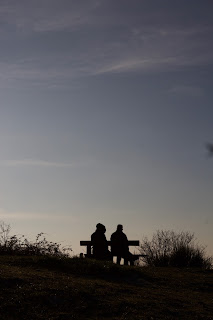
This was the photo I most happy with. I think the lighting here is best, with the two actors looking like silhouettes and the sky looking a nice faded blue. I think the photo is taken at a good distance, and the photo fits the rule of thirds quite well. I can have the information at the top, the title in the centre, and the two at the bottom. To capture this photo I had to go down the hill slightly, crouch down, and keep the out of shot. The sun is just on my left. This is the photo I am going to be using for the poster.
Reflective Comment:
I'm really happy with the photos that I was able to take. Working with natural light can be difficult and I'm glad that I could test out different angles. I am hoping to get another draft of the poster ready for the end of the week.


No comments:
Post a Comment