Magazine article
For my magazine article, I'm going to have two main bodies of text. The title and the article itself. Most magazines actually one of seven different fonts for articles. These are Helvetica, Trajan, Garamond, Futura, Bodoni, Bickham Script Pro and Frutiger. For my article itself I think I'll be using one of these fonts, whichever one goes best with the title.
The font size for the article itself will be probably be around 11/12, and with black colouring. This is the standard for the articles and it's because it works so well.
For the title, many magazines actually have their own font. Vouge and Empire both have their own fonts. However, magazines that do not have their own font often use big, bold texts like Impact or Hallosans. Depending on what tone I go with for the article will be the deciding factor on which of these two fonts I use.
The title will be extremely large and bold, making sure that it catches the eye and stands out as the title.
Film Poster
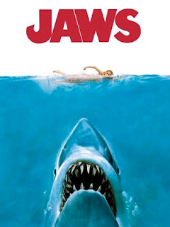
Film posters use typography to draw attention to the eye of anyone they can. The typography will also fit in with the tone of film. Some posters use unique and exciting typography to entice an audience in, while others will go for the simple, bold eye catching titles.
Considering that my poster is going to use the rule of thirds, having a large of the poster being mostly empty, it would seem that my title typography is going to large and simple. Again, I am considering fonts such as Hallosans and variations of Impact. My tagline will most likely be the same font but just with a smaller size.
Reflective Comment:
I'm starting to feel like that I have a good idea of what's going on with my poster and magazine article now. I think for the time being that I can leave them both aside so that I can focus on main production. I'm aiming to have all the filming done before the end of December, leaving me all of January to edit it, and to work on my poster and magazine article.


This is good. You will also need to deconstruct the language used within the poster and the article. Tone, register and mode of address.
ReplyDelete