One of my ancillary tasks is to make a magazine article which is talking about my short film. While I have my plans for the design of the article ready, (which can be seen here), I have only recently decided what the article itself will be saying. I found this difficult to do because I was writing a review type thing about my own film, so it just feels weird. However, I think the following paragraph will do just fine.
Dying Denial is an independent short film that looks of the process of dying. Now, while you would expect this short film to be quite depressing, it's surprisingly not. The film is about the Grim Reaper 'collecting' a young man who has recently died and guiding him to the afterlife.
During their little walk, the two talk about the meaning of life, religion, and even about what happens to animals after they die. For such a depressing subject, the film takes quite a light-hearted and calm approach to it all. The Grim Reaper is a kind and funny character, not what you'd expect from the incarnation of Death himself.
Overall it's a nice little film. It just skims the surface on what could be discussed, leaving a lot to the imagination. The idea actually has quite a lot of potential. While the film as a whole is pretty clear cut, it is still open to interpretation. The laid-back approach towards the subject matter is certainly a strong point of the film, with the two actors making it all feel very real. It's a reassuring look at death as a whole, almost to say, 'don't worry about it, it'll be fine.'
That's it for now. I'm still not quite sure how to finish it up, but I have time. Once back at sixth form I'm going to start creating the magazine article, because at this moment I actually have everything I need.
Reflective Comment:
The Magazine article is probably my least task from the brief, however it probably is the most simple. I'm almost finished with it now, I just need to actually assemble it. Like the poster, I'm setting myself the deadline of the end of January to finish.
Wednesday, 28 December 2016
Poster Draft using Film Screenshot
So I have a very clear idea for what I want for my poster. I want it to be a scene from the film itself, which is useful because that means I can test it with the footage I already have. My plan is to take a portrait photo when I film the re-shoots, as the footage that I am going to test with is landscape, which is not what I want.
So here we have my paint.net draft poster.
Here is a screenshot from my first draft.

Here is a rough edit.

Now I really want to make it clear, that this is a very rough draft. The only software I have at home is paint.net, which is not very good. However at sixth form we have Photoshop, so I can create a much better draft there. Once I have a good draft, I can experiment with a bit, get the portrait photo and create the final poster.
I know where the title and tagline are going to be placed, as seen in the draft. I'm not sure where the other information is going to go though. I have created another rough draft to show some potential ideas.

The main three other items I need on the poster are in red. I need my name, and my two actors name. I'm not sure what else to add, I quite like the simplicity of the poster like this. I was thinking that possibly the actors names could stretch across the bench diagonally.
Reflective Comment:
It's a very rough draft, but I'm getting closer to the final piece. One at school again, I'll have access to Photoshop and I'll be able to create a much better looking poster. I'm aiming to have the poster done by the end of January, which I think is a very sensible target.
Thursday, 22 December 2016
Music creating software
I have little experience in creating music, so creating some pieces for my short film is a daunting experience. My two friends Greg and Wil are both experienced in music creating so I know that I can rely on them for help. However I have found a list of potential music creating software, that is available for free, that I'm considering to use. The list can be found here!
Reaper
Reaper is a music creation software that is free for sixty days. The free trial is fine, as I only really have about sixty days until the deadline, so that's fine. It looks good, and looking on Youtube, it seems pretty good. There are also a lot of tutorials and comparison videos, so I'll have plenty of resources to learn from.
Tracktion 4/5
Tracktion 4 is supposedly similar to Reaper except for free and better looking. It's very similar to Reaper in what it offers and how many tutorials there are online. My one worry with Tracktion 4 is that it seems to be more revolved around electronic music, which is not what I am going for at all.
GarageBand
I'm pretty sure I've used Garageband before in music or something along those lines. Reviews say that it is user friendly, which is my biggest concern at the moment. It works on Apple Macs which is helpful due to the fact that's what we have to use at school. However I am unsure of how good the music itself will actually sound.
Reflective Comment:
The next step forward is to actually test these programmes. I'll probably do this after Christmas, as I am revising for my mocks which are in January.
Thursday, 15 December 2016
Testing filters
I want to see if I can edit the lighting levels in my scenes to give them a better look. With a simple adjustment to the contrast, lighting and exposure you can change the atmosphere of the scene greatly. Below I'm going to attach some screenshots of the different filters I can create, and I'll collect votes to what one looks best.
Default.

Looks normal. I think at times it looks too bright. Still good.
Edit one.

Edit two.

Edit three.

Edit four.

Default.

Looks normal. I think at times it looks too bright. Still good.
Edit one.

Looks a bit more gloomy. I think this does suit the scene better, as it's quite a depressing subject that they're talking about.
Edit two.

Similar to edit one, but a bit more saturated. I'm not sure which I prefer more. I think if it looks too saturated it can look less professinal.
Edit three.

Edit three looks more dark and depressing. I think this may of suited a more darker script, however my script is still pretty light-hearted.
Edit four.

This edit is quite close to black and white, and therefore looks quite dull and empty. I do think it fits, however I think again it's a little too gloomy for the final cut.
Reflective Comment:
I think that edits one and two look the best. I think they suit the film as a whole well, and add to the atmosphere. I'm going to collect votes for each of the edits and see what tests best with audiences.
Wednesday, 14 December 2016
My first draft of Dying Denial
I've created the first draft of Dying Denial! Overall I'm very happy with the first draft. Of course it's not perfect but it's a work in progress. I've attached it below.
So now moving forward, here are my plans.
Edit the footage's lighting and contrast levels to achieve the correct balance.
I want to mess around with the settings to see if I can find a suitable effect for my short film. I want the film to look a bit greyer, possibly getting greyer closer to the end of the film.
Attempt to look at suitable music for the scenes so far.
Music is a big worry of mine, so the sooner I start looking at it the better. I need to look at software I am also going to use.
Try to fix the sound, as it sounds patchy at times.
Really this just means find out how to reduce the sound of the wind, because it is so loud! Hoping to fix this soon.
Create a version of the first draft pointing out errors and things that need to be fixed.
This will be great for reflection and really helpful for trying to decide what needs re-shooting and what doesn't.
Organise some re-shoots with my actors.
This shouldn't be too hard, as I've already confirmed with my actors with scenes need re-shooting. They have already said they should be available.
Reflective Comment:
I am happy with my first draft, but there are clearly some things that need to be worked out. Sound, music, and reshoots all need to be added and done to really refine my short film.
Thursday, 8 December 2016
Length of short film
I've nearly finished editing the footage of my short film that I got on the 3rd of December. This footage should make up about 2/3 of the film, so should be about 3:30 minutes in length. The specification makes it clear that the short film is meant to be around five minutes.
However I have noticed that the edit I have already created, which is missing footage, is almost reaching the five minute mark. I fear that once I have everything filmed and I put it together, it will be over the five minutes we are allowed.
To counter this I am going to have to take some footage out, which actually works in my favor in a sense. Some scenes aren't as strong as others and some of the script actually repeats itself, something I had not noticed at the time. If I can reduce the time of the film and take out these repetitive scenes.
Reflective Comment:
I always sort of knew from early on that I was going to have a bit too much footage. I think it's better to have too much footage rather than too little. I should be able to work around this problem fine though!
Footage of my filming
When I filmed my footage last saturday I had my friend and fellow student Fabian get some photos and footage of my filming. I've attached some of this below so that you can see it.


Reflective Comment:
Having footage of my filming is evidence that I was the one who filmed my short film. It's also helpful in analysing what I can do to make the next shoot work better.


Reflective Comment:
Having footage of my filming is evidence that I was the one who filmed my short film. It's also helpful in analysing what I can do to make the next shoot work better.
Monday, 5 December 2016
Problems I faced while filming
While I did my filming I faced a few problems. It was a good, productive day. There were a few small problems that I had to deal with though, and some I didn't realise until we had stopped filming and I was editing.
Sound
In the background of many of my shots you can hear a lot of interference. This I can deal with during editing, however there are some things that I can't work round so easy. In some shots there are motorbikes revving past and car horns being extremely loud. There isn't much I can do about this, except not using those scenes.
Weather and lighting
Something you have to fight when filming outside is the weather and the lighting. During one of my scenes it begins to rain, this itself wasn't a problem, however the problem was that some rain dropped on to the camera lenses. It was so faint, that I couldn't see it at the time. Now, on a big screen, you can faintly see it. I can't really do anything about this until I re-shoot it.
Also, during two scenes the lighting is really strange. For some reason, the lighting goes an orange color. I haven't tried editing it yet, so we'll have to see if I can work around it.
Reflective Comment:
These are minor problems that I'm facing. I could have a lot worse problems, so I'm not to be bothered. I can work round these problems.
Location Test Footage
On the 3rd of December I got some of my filming done. Before my actors arrived I decided to capture some test footage to get a look at the lighting, footage quality and sound. I have made a quick video in which I show the test footage and list what's good and bad about it. I have attached the video below.
I recommend enlarging the video. For some reason the upload to my blog has caused the quality to significantly drop. Hoping to fix that soon.
Reflective Comment:
The test footage I got was quite helpful, as it gave me a chance to prepare for the filming. I can see what needs to be improved and can start planning on what I'm going to do counter my problems.
First Day of Filming
I had my first day of filming on the 3rd of December and it went very well. I got over 2/3 of the film the filmed, and while the footage I got may not of been the final footage I use, it's still good to have gotten so much done.


My actors were helpful and cooperative, and to my surprise they actually already knew each other! This meant I didn't have to make introductions and there was already good chemistry between them both. We filmed for around three hours.

I was happy with the shots I got. While I think they may need to be edited in some ways, I'm really happy with how parts came out. I had a good variations of shots, and knowing that I have another scene to film I can fit more unique shots in there.

The costumes looked a whole lot better than I thought they would. The Reaper costume was great and the costume for Nathan was near enough to what I had imagined.

My one biggest worry is the audio. The cameras used weren't the best for audio, and there was a strong wind at certain points. I think I'll be edit the sound of the footage to make it sound better, but I will have to see.
Reflective Comment:
I'm really happy with how my filming went. I was really worried about the weather, the costumes and how the footage was going to come out. But I'm actually really happy with it. I'll have several posts coming soon on organising my footage, testing some editing, and putting some of it together.
Wednesday, 30 November 2016
Small changes to the script and possible filming changes
Filming is planning to go ahead this Saturday, as I have managed to get the actors to agree on times. However, I have had to make a few changes to the script to cater these changes. It's nothing massive, and it doesn't really change the plot of the film in a significant way, but they had to be made.
The first change is that Nathan is going to get changed before they go out on their walk. I have been un-able to acquire the costume that I had wanted Nathan to wear throughout the film, the dressing gown, so that costume will only be appearing in the first scene. (I have decided to film the first scene later on, possibly after Christmas.) While this is annoying because I wanted him to have that costume for the entire duration of the film, there isn't much I can do about this unless I re-shoot. The other change is regarding the dialogue, which doesn't quite fit with the new actor I have.
I have ordered the Grim Reaper's costume, however it's meant to arrive Friday. In the worst case scenario that it is late, I'll be left without a costume for my Grim Reaper, which is crucial to his image. If this is the case, I'll shoot the scenes as planned and use them as test footage. Test footage is better than no footage. My actor did send an audition with a Grim Reaper costume, so I may use that for the test footage, so it may be salvageable.
Reflective Comment:
I feel like filming is becoming much more likely now that we're approaching the first filming date. I've got my actors sorted, which was my biggest worry. The script is ready, costumes are some-what ready, and I have a plan.
Similar Posters
My good friend Jude sent me a link yesterday, which shows how off movie poster cliches. There is a whole section about posters that feature benches. Here is the link : http://voguesugar.com/movie-posters/
Here are all the posters that they say fit the cliche.

This image alone is really helpful in understanding the conventions of the typical bench poster. I can see the typical conventions, such as typography and fonts. When it comes to designing my poster, I feel that this will be very helpful.
Reflective Comment:
Pretty happy that I've found this page, as it's going to be very helpful when designing my poster. You can already see a clear trend with these posters, and I now can decide if it's going to be conventional or not.
Monday, 28 November 2016
Organising Actors
Organising my actors has been very difficult. Due to the fact that all the communication is having to be done through email. I had four actors willing to play the Grim Reaper, and two actors willing to play Nathan.


The Grim Reaper
Ben Mansfield
Ben Mansfield fit the role of the Grim Reaper very well, and I was quite eager to work with him. However due to his religious stand point, he could not continue on with the project. I sent him four emails.


Andy Turner
Andrew was my number one choice for the role of the Grim Reaper. His showreel was impressive and I thought he would of fit the character well. However, despite interest in the film, Andy had to drop out due to a busy calendar over the time I was needing to film. I sent him seven emails.


Peter Long
Peter Long is the actor I have chosen to play the role of the Grim Reaper. He sent me an video audition and I was really happy with it, and I think he'll fit the role nicely. I'm looking forward to working with him. I've sent him over twenty emails.


Ronan Lumb
Ronan originally applied for the role of the Grim Reaper. He sent me a video audition and I liked it quite a lot, however I chose to go with Peter Long. However due to a change of circumstances, I have decided to ask Ronan if he is interested in playing the role of Nathan. I'm still waiting on a reply, but I'm sure he'll be interested. I have sent him over twenty emails so far.


Nathan
Joshua Gould
Joshua was my first choice for Nathan. I actually sent the listing hoping that he would respond. He was really interested in the film, and I thought he was going to be in it. Then he never replied, and it's been over a month now and I still haven't heard anything. It's a shame. I sent Josh five emails.


Jack Galer
Jack Galer was my second choice for the role of Nathan, however he's made things a little bit difficult. I had to change my filming dates for him and he is no longer responding. Because of this, I have decided to uncast him. I have sent Jack over twenty emails.


Reflective Comment:
Working with actors has been hard. I think the actual filming will also be difficult. But I know that the payoff will be worth it. Also, it's experience that I am going to need if I am going to work in media.
Saturday, 26 November 2016
Storyboards and shot list
In preparation for filming soon I have started storyboarding and made a shot list. I've made my storyboard using post it notes as it makes it very easily to re-order the narrative. Below I have attached a picture of my storyboard for the first thirty seconds on the short film.


Thursday, 24 November 2016
Creative Typography (Part 1)
I've been starting to use tutorials online to help improve my photoshop skills for when I make my poster. I was really interested in layering photo into text, so that's what I learnt to do. Below is what I learnt how to do.

I'm pretty happy with what I learnt how to do. I done four examples. The water and fire examples were very simple and quite easy. I think it's a nice effect, especially the water one.
I wanted to try something that was recognizable. I decided to do The Walking Dead, as it's a very popular show and you can be quite imaginative with the typography. For the first one, I decided on a simple cover, with the show's recognizable zombies.
For the second Walking Dead one, I tried to be more unique. The recent season six finale was a crucial part of the story, and one of the most memorable from the comics. It ended on a cliff hanger where you didn't know who died. I decided to have the four main characters who people were thought going to die in the text. Rick, the leader, Glenn the fan favorite, Abraham the most likely candidate, and Maggie, the wife of Glenn.
I think the typography is quite effective and I really like it. It's not perfect, but I did get it done in around ten minutes. Overall, I'm quite happy with I've learnt.
Reflective Comment:
I'm very happy with I've learnt, and I feel that I'm becoming more experienced with Photoshop as a whole. Over the next few weeks I'm going to try do more of these, learning more skills as I go along. If I do enough of this, when it comes to making my actual poster, I'll have enough experience to make a professional looking poster.
Filming Dates
I was originally planning to film my short film over the weekend, on the 26th and the 27th. However, due to my actors being unavailable for these dates, I've had to move things around. We're now planning to film on the 3rd and the 4th of December. If for whatever reason this doesn't go to plan, I have two back up actors however if things do not go to plan.
Instead, I am going to use this weekend to get some test footage. I'm going to go to my location, film some footage and then test the sound and lighting. I imagine I'll have more control of this in my house, so testing the footage outside will be very important.
If I am unable to film on new dates, I'm going to have to push it back another week. I'd rather this not happen, as I need to get filming out of the way as soon as I can. My plan is having the majority of filming done by the end of December, and then the ancillary tasks done by the end of January. This will give me February to make sure everything is finished to a good quality.
Reflective Comment:
Getting close to the end of term, I did start to panic a bit when my actors said they couldn't film. However I've worked my way round it and hopefully everything we'll be going to plan. I knew I'd likely encounter problems like this when I decided to find actors instead of using friends, but I'm hoping the pay-off will be worth it.
Monday, 21 November 2016
Gender representation
In my short film there are only two characters, both of which are male. There are no female characters that feature in the film at any point. Therefore, I have to only discuss male representation.
General Representation
Males in film are often represented as being in charge. They're strong, brave, attractive and smart. They're who the audience roots for and normally most relatable, due to conventional films aiming for a white male audience. Sometimes the man might doubt himself, but by the end of the film he's sure of himself, and able to save the day or get the girl. The younger men are normally more full of life and optimistic, while the older men may come across more fed up or wise. One of the most crucial aspects of a male character however, is that they always seem to be in control.
Nathan
Nathan really isn't a conventional male is my film. He doesn't have to save anyone, he isn't trying to woo some girl and he isn't trying to make his life better. He's trying to accept his death. He also isn't very confident or strong, instead he comes across a bit nervous and weak. I have chosen to go down this route because I wanted a character that was a bit different. Most films would have a man try fight for his life, bargain some way out, but Nathan slowly comes to accept it.
Death
The Grim Reaper in my short film is portrayed as a man. However, like Nathan, he isn't all that conventional. He's in a better position that Nathan, but he still doesn't know much and doesn't have much control over the situation. He is just doing his job. He's just an average guy, who's job just happens to be guiding the dead to the afterlife. He isn't in his prime, he doesn't come across overly strong or smart, he's just a guy.
Conclusion
Most films take an average man and turn him into some sort of hero, defying the odds and always coming out on top. This is where my film is different. Both the male characters just accept the way things are, and come across as more relatable characters. I chose to do it this way because it would make the characters seem more realistic and therefore are easier to relate to.
Reflective Comment:
I'm not really challenging gender stereotypes all that much with my short film. While my two characters are conventional, they aren't truly challenging gender representation. They're still men and they're still the central characters of the film. If there were any female characters in the short film, I probably could challenge gender stereotypes. However, I chose to have two male characters.
Friday, 18 November 2016
Typography
Typography is a very important yet overlooked part of both poster and magazine design. Different fonts can say different things about a poster, and the size of text can indicate how important it is compared to other parts of the text. The colour has to match the backdrop and contrast it well. Meeting all this criteria at times can be quite difficult. Therefore I'm going to break down the typography for both my magazine article and film poster.
Magazine article
For my magazine article, I'm going to have two main bodies of text. The title and the article itself. Most magazines actually one of seven different fonts for articles. These are Helvetica, Trajan, Garamond, Futura, Bodoni, Bickham Script Pro and Frutiger. For my article itself I think I'll be using one of these fonts, whichever one goes best with the title.
The font size for the article itself will be probably be around 11/12, and with black colouring. This is the standard for the articles and it's because it works so well.
For the title, many magazines actually have their own font. Vouge and Empire both have their own fonts. However, magazines that do not have their own font often use big, bold texts like Impact or Hallosans. Depending on what tone I go with for the article will be the deciding factor on which of these two fonts I use.


The title will be extremely large and bold, making sure that it catches the eye and stands out as the title.
Film Poster
Film posters use typography to draw attention to the eye of anyone they can. The typography will also fit in with the tone of film. Some posters use unique and exciting typography to entice an audience in, while others will go for the simple, bold eye catching titles.

Considering that my poster is going to use the rule of thirds, having a large of the poster being mostly empty, it would seem that my title typography is going to large and simple. Again, I am considering fonts such as Hallosans and variations of Impact. My tagline will most likely be the same font but just with a smaller size.
Reflective Comment:
I'm starting to feel like that I have a good idea of what's going on with my poster and magazine article now. I think for the time being that I can leave them both aside so that I can focus on main production. I'm aiming to have all the filming done before the end of December, leaving me all of January to edit it, and to work on my poster and magazine article.
Magazine article
For my magazine article, I'm going to have two main bodies of text. The title and the article itself. Most magazines actually one of seven different fonts for articles. These are Helvetica, Trajan, Garamond, Futura, Bodoni, Bickham Script Pro and Frutiger. For my article itself I think I'll be using one of these fonts, whichever one goes best with the title.
The font size for the article itself will be probably be around 11/12, and with black colouring. This is the standard for the articles and it's because it works so well.
For the title, many magazines actually have their own font. Vouge and Empire both have their own fonts. However, magazines that do not have their own font often use big, bold texts like Impact or Hallosans. Depending on what tone I go with for the article will be the deciding factor on which of these two fonts I use.

The title will be extremely large and bold, making sure that it catches the eye and stands out as the title.
Film Poster
Film posters use typography to draw attention to the eye of anyone they can. The typography will also fit in with the tone of film. Some posters use unique and exciting typography to entice an audience in, while others will go for the simple, bold eye catching titles.


Considering that my poster is going to use the rule of thirds, having a large of the poster being mostly empty, it would seem that my title typography is going to large and simple. Again, I am considering fonts such as Hallosans and variations of Impact. My tagline will most likely be the same font but just with a smaller size.
Reflective Comment:
I'm starting to feel like that I have a good idea of what's going on with my poster and magazine article now. I think for the time being that I can leave them both aside so that I can focus on main production. I'm aiming to have all the filming done before the end of December, leaving me all of January to edit it, and to work on my poster and magazine article.
Thursday, 17 November 2016
Sound, lighting and continuity
Above is a presentation about sound, lighting and continuity. In it I go through why each of these elements are important and how I feel about them.
Reflective Comment:
Reflecting on what I'm worried about I think is quite important. One of my teachers also spoke to me for a while and helped me think of some solutions to some of the problems I think I face.
Wednesday, 16 November 2016
Magazine article and poster breakdowns
I have created a presentation on breaking down magazine articles and posters. I've looked at the core concepts of the designs to try influence and improve my own ideas.
In the final slide you can find another draft of my poster. It's a little bit more clearer on my ideas but it still needs work. I have attached it below.

In the final slide you can find another draft of my poster. It's a little bit more clearer on my ideas but it still needs work. I have attached it below.

Reflective Comment:
I have a better understand on how to improve my poster now. I need to add more information such as actors and cast, and also possibly add some quotes about the film. I also need to work on the rule of thirds.
Thursday, 10 November 2016
Planning magazine article

So above is a very very very rough draft of the layout I want for my magazine article. Taking inspiration from magazines like Empire, which I spent about twenty minutes reading through, I have decided I want tot ry replicate the type of articles they have.
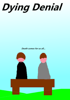
The poster is going to have the Grim Reaper and Nathan sitting on the bench, looking at each other confused. I want to have the same backdrop for the article. Where it says text several times, I want the photo's background to be the sky\ground\ but slowly fading out to a whitey grey colour. In the middle, where it says photo, I want Nathan and the Grim Reaper looking at each other.\
The next step I am going to take for this task is to take a rough photo so that I can insert it in and show what I want to have, and to decide what I am going to write in the boxes. I'm hoping to have this done by the end of next week. With this I can start to create a better looking draft.
Reflective Comment:
I'm now making slow progress towards both of my ancillary tasks. I'm getting there with the poster, and now I have a good idea of what I want for my magazine article, which is what I'm worrying about more. However, I'm starting to feel more reassured and relaxed about both the ancillary tasks.
Monday, 7 November 2016
Semiotics
Above is a slide about the technical codes of the film-making. Understanding this and being able to discuss it will not only help with my exam later on in the year, but it will also help me create a better short film.
Mise En Scene
Location
My short film features three main locations, each which represent a different part of Nathan's acceptance of his death. The first scene is set in Nathan's house, where the kitchen is a mess and it's poorly lit. This is meant to show that Nathan hasn't really got the best life, and that he's in no position to be ready to change.
The next location is in the forest, which is the middle of the film. This is Nathan in the open, while he is used to the confines of his house. However the forest is still secluded and represents how Nathan isn't quite ready to come out into the open and accept his death.
The final area is on the hill, which is where Nathan finally accepts that he's dead. The location is open and it's going to be bright, which represents Nathan's acceptance of what is to come next.
Dressing Props
As mentioned above there are several things that I want in scene one to have to set the scene. I want to have all the surfaces be covered in crumbs and stains, the washing up to be piled up and for the blinds to be drawn.
Costumes
I have two costumes which both represent different things that I have thought through quite a bit. The first is the more obvious, which is the Grim Reaper's costume. It's a costume that is so easily recognised, everyone knows the Grim Reaper. His costume is very clear, however Nathan, even with this clear evidence, cannot first accept the situation.
Nathan throughout the short film is wearing his dressing gown. This is meant to represent how Nathan is just so unprepared for his death. He isn't even ready for the occasion. Walking around in his dressing gown is meant to make him look slightly pathetic, while still making the audience feel bad for him.
Reflective Comment
My short film is full of symbolism, mainly due to the clear theme of death and acceptance. I'm hoping to fill my film with different pieces of symbolism and to encourage several different rewatches of my short film.
Friday, 4 November 2016
Equipment list
Above you can find a slide on the equipment that I will be needing. I have covered everything I believe I need for the filming and editing process, but if I do have to add anything the slide will be automatically updated.
Reflective Comment:
Knowing what equipment I am going to need for the filming process is obviously crucial to sort out before I begin filming. This is just one of the tasks on my to do list that I have now completed.
Thursday, 3 November 2016
Task list for filming
I'm planning to hopefully film all of my short film over one weekend, the 25th and the 26th of November. I have a list of things that I need to accomplish before the filming, so I have decided to create a to do list to keep on top of anything.
So in no particular order, here are my tasks that relate to filming.
- Finalise my actors
- Test footage at the locations, looking for sounds that will needed to be edited out.
- Order the costumes
- Gather an equipment list
- Assemble a small crew
Reflective Comment:
Making sure that I can keep on top of everything is crucial to making sure that filming goes smoothly. My time management so far has been quite good so I'm hoping that this short task list will help continue with keeping up.
Assessment Criteria
Level 4 16–20 marks
• Planning and research evidence will be complete and detailed;
• There is excellent research into similar products and a potential target audience;
• There is excellent organisation of actors, locations, costumes or props;
• There is excellent work on shot-lists, layouts, drafting, scripting or story-boarding;
• There is an excellent level of care in the presentation of the research and planning;
• Time management is excellent.
To achieve a level 4 in my short film which is what I aiming for, I will need to meet all of these targets. So far I believe that I am on track.
Tuesday, 1 November 2016
Poster planning
While the short film is the most important part of the coursework, the two ancillary tasks are also important. For the poster, I know what I want. You can find where I explain this in this post. I am planning to take the photo for the poster when I film the scene that the poster is replicating.
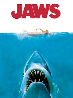
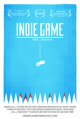
I'm hoping to take several shots of the same scene from different distances and different angles so that I can decide later which one to use. I'm wanting to use a very simple and bold text, something like Impact. Below I have attached some indie movie posters that I can draw inspiration from.


Reflective Comment:
The main reason for this blog post was to make sure that I know what I am doing for this ancillary task. I have to make sure that I don't get so caught up in making the short film that I actually forget to complete the ancillary tasks.
I'm hoping to take several shots of the same scene from different distances and different angles so that I can decide later which one to use. I'm wanting to use a very simple and bold text, something like Impact. Below I have attached some indie movie posters that I can draw inspiration from.
Reflective Comment:
The main reason for this blog post was to make sure that I know what I am doing for this ancillary task. I have to make sure that I don't get so caught up in making the short film that I actually forget to complete the ancillary tasks.
Monday, 31 October 2016
Risk assessment
Since we're getting very close to filming we have to make sure that every based is covered. One of the crucial things that we must cover is health and safety. Since I'm filming outside for the majority of my film, there are a few risks. I have created a risk assessment table which can be found below.

Reflective Comment:
Getting closer to filming it's good to have another task checked off. I don't really think there will be any accidents on set as it's quite a small crew and a short film, however it is best to safe rather than sorry.

Reflective Comment:
Getting closer to filming it's good to have another task checked off. I don't really think there will be any accidents on set as it's quite a small crew and a short film, however it is best to safe rather than sorry.
Saturday, 29 October 2016
Script Changes
I have completed the fourth draft of the script now, which I think will end up being the final version. The biggest and most notable changed I made was with the locations. A large part of my short film consists of the two characters walking and talking. Originally, this was to be set on ordinary streets.
I had chosen this so that the two characters stood out greatly. However I have made the decision to change this location for practicality. Filming on streets will mean I'll have to edit out all sound from cars passing by and wait for the streets to be empty from pedestrians. I can see this taking way too long to deal with, causing problems with production.
I have instead change it so in this scene the characters are walking through a forest. While it is not what I wanted for the short film, I understand that due to a set deadline I may struggle to finish on time if I don't make this change. I realised I'd have to make this change after watching another short film, which you can find on this post.
Reflective Comment:
Making this change will make production a whole lot easier. While it is not a change I would like to make, I understand that it is necessary.
Thursday, 27 October 2016
Other related products
Over the half term I have been able to find some products that relate to me in some form. However none of them really follow the same direction I do, and instead have very different messages. Below I have embedded these examples and written a small paragraph about it and what inspiration I can draw from it.
I really did enjoy this short film. While the Grim Reaper and dying character do not interact, it still is quite similar to my short film. What I really liked about this short film however was the music. I've been struggling with what music I should use for the first half of my film, and I feel the curious music used here would fit fantastically.
I loved this short film. The concept is just something that I've always enjoyed, the idea that the Grim Reaper is just an ordinary person. The first minute of the short film however, where Death is walking the streets, is very similar to what I want to do for my short film, and it's quite helpful to see what it would look like. The cinematography also was a highlight of this short film, something I'm hoping I can replicate.
This short film is the closest in similarity to my short film. In fact it's very very similar. However, it's a bit more depressing with a positive ending. Where my short film is a bit more positive, with a quite bitter sweet ending. The biggest difference is that in this film, the dying man gets to live, while in mine he does have to die. But this short film is really interesting and well done, and quite helpful when trying to piece together what my short film will be like.
Reflective Comment:
These three short films are all exceptionally well done and very useful to me when trying to understand what my short film is going to be like. From these examples I have a better idea on the type of music, cinematography and atmosphere that I want for my short film.
Character Costumes Shopping
I only have two characters in my short film. Nathan, the character who has died, and the Grim Reaper. From the start of the pre-production I've known what costumes I wanted for both characters. For Nathan I've wanted a simple get up, which is a dressing gown. I explain why I chose this costume in better detail in this blog post.
post. http://jackculluma2mediasprowston.blogspot.co.uk/2016/09/character-costumes.html
This blog post is about looking at actual costumes. The one problem that I face is that I don't really have all that much money to spare for the film, so finding a high quality costume that I'm happy with will be quite difficult. This is more true for the Grim Reaper.
The Grim Reaper
For the grim reaper I want something that looks quite heavy and covers all of the body. Here are some potential options.


Nathan
For Nathan I want something quite simple. Just a dressing gown. It's simpler because I don't have to worry about it looking fake or like a standard Halloween costume, and measurements won't be difficult or awkward. Here are my options.


Honestly, there isn't much of a hard decision with this costume. In my head whenever I picture the film, it's always a grey dressing gown. That's really the only criteria I have for it. Any of these would do, so I'll probably just choose the cheapest option. I may even be able to find one cheaper in stores.
Reflective Comment:
It's getting very close to when I have to start filming. I have to decide on costumes and locations very soon so I'm glad that I'm starting to make progress with the costumes. As soon as I have confirmed the actors, which I am hoping to have done by the 4th of November, I'll order the costumes.
post. http://jackculluma2mediasprowston.blogspot.co.uk/2016/09/character-costumes.html
This blog post is about looking at actual costumes. The one problem that I face is that I don't really have all that much money to spare for the film, so finding a high quality costume that I'm happy with will be quite difficult. This is more true for the Grim Reaper.
The Grim Reaper
For the grim reaper I want something that looks quite heavy and covers all of the body. Here are some potential options.


So out of the three I think I most definitely prefer the third option. Unlike option one and two it doesn't look too much like a Halloween costume. It looks heavy and I can see it working. The only problem with option three is that it's measurements are quite specific, and I still do not what actor I'm going with.
For Nathan I want something quite simple. Just a dressing gown. It's simpler because I don't have to worry about it looking fake or like a standard Halloween costume, and measurements won't be difficult or awkward. Here are my options.


Honestly, there isn't much of a hard decision with this costume. In my head whenever I picture the film, it's always a grey dressing gown. That's really the only criteria I have for it. Any of these would do, so I'll probably just choose the cheapest option. I may even be able to find one cheaper in stores.
Reflective Comment:
It's getting very close to when I have to start filming. I have to decide on costumes and locations very soon so I'm glad that I'm starting to make progress with the costumes. As soon as I have confirmed the actors, which I am hoping to have done by the 4th of November, I'll order the costumes.
Subscribe to:
Posts (Atom)